Salt & Spruce is a distinctive nautical-themed boutique nestled in Pemaquid, Maine. Carefully handpicked, the store showcases coastal decor, timeless antiques, and handcrafted artisanal pieces—all curated by its founder, Rachel Brand. When Rachel inaugurated the shop, she sought expertise in branding and logo design. Inspired by the shop's name and location, one imagines diving into pristine lakes surrounded by evergreens, spending summer evenings amidst fishing boats and lobster traps, and cozying up by a campfire under a plaid blanket. The logo needed to encapsulate the essence of Maine and its timeless antiques. Below is a concise chronicle of the Salt & Spruce brand journey.
Saltandsprucemaine.com
The initial mood board created to get aligned with the founder on the general feeling of the shop and it’s aesthetic, which would guide me towards the right font and look.
Below, I started to explore how to use the actual spruce branch into the logo. These were created drawing on the ipad using Procreate and brought into illustrator to clean up and vectorize.
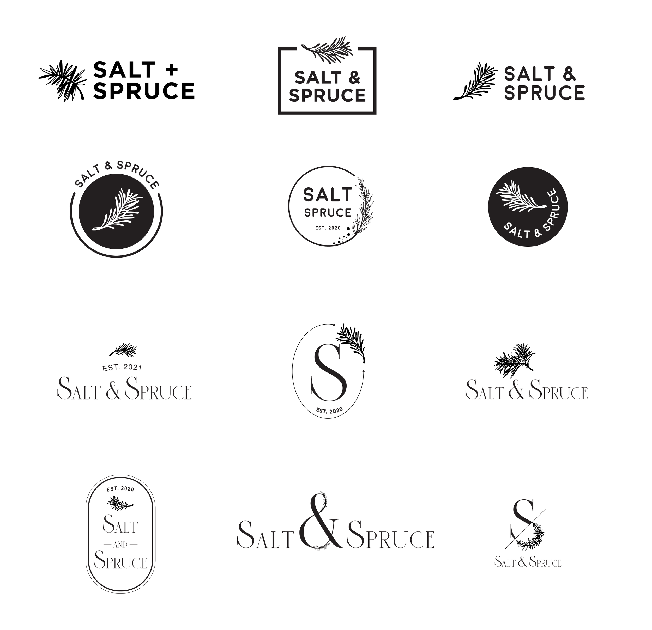
Below are some of the iterations of the logo… the top row went in a more clean modern direction while the bottom two rows used a serif font going in a more classic direction.
Above Photos by Salt & Spruce
The Founder and I worked through various fonts, and graphics before finally landing on this as her final pick. Once the logo direction was decided, I began to explore how color could be incorporated into the design.
Below, are examples of how the logo can be used for shop needs like tote bags, stamps on price tags, and stickers for wrapping.
Above Photos by Salt & Spruce


